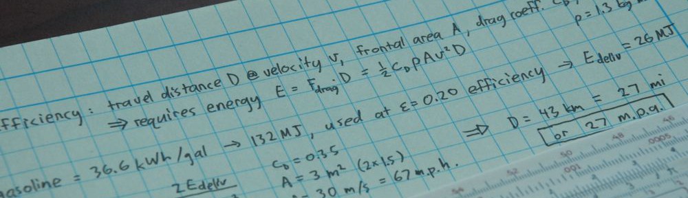
I created this graphic to accompany a post on moving past dualism. The classic yin-yang graphic has a stark black and stark white symmetric pair with a hard line of demarcation. This one blurs the line and shows two aspects of the same overall phenomenon, but still maintaining some discernible difference—just no hard line and 256 shades of gray. By the way, anything I make is intended to be available for use with attribution and for non-commercial purposes (CC-BY-NC). I’m too lazy to formalize, but that’s my general position.
I struggled to come up with a scheme to generate this visual. I first turned to Adobe Illustrator, but threw in the towel after less than 10 minutes. I decided that Python (and matplotlib) would work better: I could define mathematically the curves for color gradients.
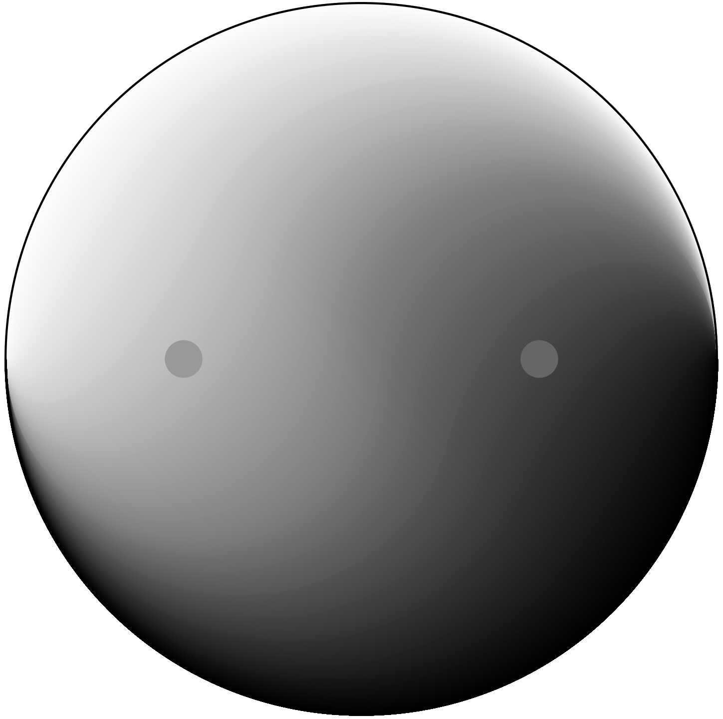
My first attempts were disappointing. I decided to run along the x-axis, move some fraction of the way between the curvy S-shaped dividing line and the outer perimeter and assign a grayscale color to that position according to the distance between the inner and outer bounding curves. The problem was that the vertical slope in the center of the diagram translated to a rapid shift and produced a steep and very distracting gradient along the vertical axis. Here are contours for shading. I needed to flatten those vertical jumps, and gave up after many schemes failed to produce “pretty” results.

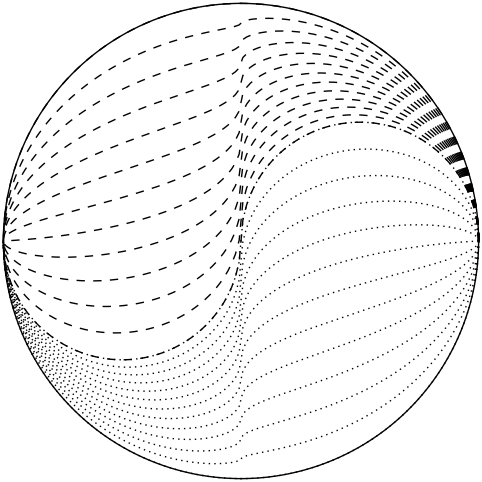
I jumped ship to a new scheme whereby I would connect the S-curve to the outer perimeter not in vertical lines, but via diagonals. From the center, I wanted to go off at a 45 degree angle toward the edge and assign grayscale linearly along this axis. To accomplish the mapping, I used a quadratic function. As the S-curve angle went from 0 to 2π, I wanted the outer to go from 0 to π but fast at first, getting 3/4 of the way around when the S-curve was still at its halfway point. A simple quadratic did exactly this (based on the square of one-half being one-quarter). The resulting contours are shown here, along with blue lines indicating the lines along which the color gradient was determined. The contours now look graceful without any kinks.
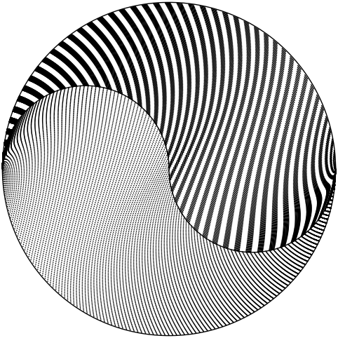
Amusingly, when I created the graphic above for this page, I forgot at first to change the number of steps from 128 to 12 (128 for smooth color fade; 12 for visible contours). The result was actually kind-of pretty, so here it is as entertainment. The dashes and dots on each side align to make stripes in a cool way. I also like the distortions on the sides. The pattern gets a little pale in some regions as the contours separate out a bit and dilute the solidity of the dash aggregations.
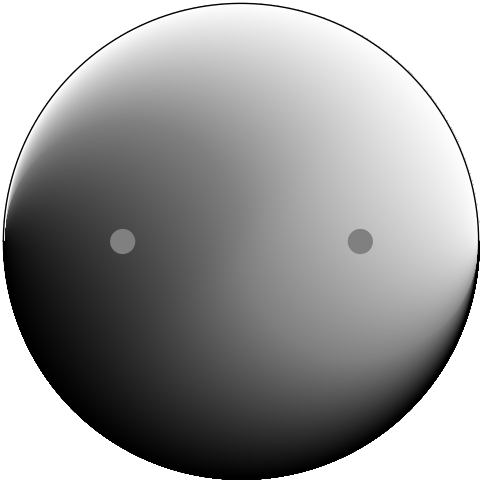
Finally, I found it amusing that when I originally put in the eyes, I instinctively made them the same color: a mid gray at level 128 (hex code 80, or in RGB ‘#808080’. But the result looked very odd, according to the classic illusion of contextual colors/shading. The result is at right. The right-hand “eye” looks much darker than the left, though I assure you they are the exact same. Make a mask with two holes and you’ll see. In the final version (top of page), I changed to hex 66 and 99 (I gravitate toward repeating numbers, so RGB hex ‘#666666’ for instance), corresponding to levels 102 and 153 (average around 128). A shift of ±20% to achieve sensory balance is no small effect!
Views: 227