
 Last week, I reported the surprising realization that official population projections from the United Nations adhere to a notion of future fertility that appears to be immediately at odds with present real trends. The recent rapid decline in population growth—even pre-COVID—suggests that a population peak prior to 2050 is not outlandish, provided that current drivers continue to apply. Recent declines in fertility rates, together with a flattening age distribution of young folks, combine to set the stage for population peak and decline.
In the previous post, I performed two embarrassingly crude projections of recent trends (simple curve fits) to demonstrate that a population peak as soon as 2042 or even 2033 should not be ruled out, and in fact seems to be where we’re heading if present trends continue.
I mentioned that I was working on tooling up a more sophisticated model to do some exploration of my own. The goal was to track the nuances of actual age distributions across the world, together with alternative ideations of fertility evolution (greater weight on what is actually happening lately), and allowance for non-monotonic evolution of medical care and life expectancy going forward. It was a daunting task, but I was consumed with curiosity and powered through the exercise over a few intense days.
In this post, I will give an overview of what goes into my demographic projection model, why I believe it works well enough to be useful, and what top-level questions we can explore using it.
Model Highlights
I won’t go into every detail on the demographic model I constructed. That’s the beauty of writing a blog post as opposed to an academic article for peer-review. I’ve had about enough of the latter in my life. But I do want to provide some sense of the degree of sophistication that I felt was necessary to do a semi-credible job. Feel free to skip the nerd crap and pick up again at the “Let’s Take it for a Spin” section.
As an overview, the following list captures the elements one needs in order to perform basic demographic calculations. References to “regional” variation in my case means breaking the world into six geographical/cultural domains: Africa, Asia, Europe, Latin America and the Caribbean (including Mexico), Northern America (mainly the U.S. and Canada), and Oceania (see Geographical Regions tab here for explicit definitions). In any case, one needs:
- Regional age distribution at the start of the simulation, differentiated between male and female, in five-year age increments.
- Regional population-weighted averages of the most recent age-specific fertility rates.
- A model for regional evolution of Total Fertility Rate (TFR).
- Male/female birth ratio.
- Regional trends and projections for survival to the next year as a function of age and gender.
- Some accounting of migration in and out of regions, as a function of age and gender.
The following sections work down this list, addressing each in turn.
The Pyramid
This site is a good place to visualize historical and projected age distributions (“population pyramids”) based on U.N. numbers and projections for different countries and regions, from 1950 to 2100. Hovering over bars reveals absolute population numbers, and hovering over the graph at right updates population estimates: click to get the associated age distribution.
Age-Specific Fertility Rates
Age-specific fertility rates (ASFRs) are also available from the U.N., expressed in terms of number of children per thousand women in various five-year age brackets from 15 through 49 years. For example, the table below has numbers for the United States in 2017. The most popular age for child birth is 25–34, the two contributing five-year groups nearly tied at around 100 annual births per thousand women (meaning that about 10% of women in this age range would give birth that year). Because there were 10.994 million women in the U.S. in 2017 in the 30–34 group, at 100.3 births per thousand women, we expect 1.1 million babies that year from this age group. In total, almost 4 million babies were born in the U.S. in 2017.
| Age Range | ASFR | F pop (M) | Births (M) |
|---|---|---|---|
| 15–19 | 18.8 | 10.59 | 0.199 |
| 20–24 | 71.0 | 10.86 | 0.771 |
| 25–29 | 98.0 | 11.46 | 1.123 |
| 30–34 | 100.3 | 10.99 | 1.102 |
| 35–39 | 52.3 | 10.80 | 0.565 |
| 40–44 | 11.6 | 10.11 | 0.117 |
| 45–49 | 0.9 | 10.81 | 0.010 |
| Total | 352.9 | 75.62 | 3.887 |
Total Fertility Rate
A key linkage is that adding the seven ASFR numbers and dividing by 200 (collectively accounting for 5 year groupings and per-1000-women) produces the total fertility rate (TFR), in this case: 352.9/200 = 1.764. The interpretation is that each woman, on average, gives birth to 1.76 babies as they pass through the reproductive age range.
From year to year, the age-adjusted rates change, but more in overall magnitude than in relative age distribution. It will remain true that a small fraction of women over 45 have babies, and that peak productivity coincides with early-mid years, so that the shape of the distribution is pretty stable over time. [As a nerdy aside, if the demographics are perfectly flat (equal representation per age block, as is very nearly true in the table above), the distribution does not even matter and the TFR alone suffices to predict births. In the case above, the average number of women in each annual bin is 75.62 million divided by 35 years, or 2.16 million women in each year. That’s the scale of the child-bearing annual cohort. If each woman gives birth to 1.764 babies on average, then we multiply the cohort size (2.16 million) by 1.764 to get 3.8 million births per year (close to the actual number—not exactly because the age distribution isn’t actually perfectly flat).] Given this relative insensitivity to the age distribution, I was content not to bother modeling the future evolution of the shape of the age-specific fertility rates, and simply adjusted the overall scale annually to follow the evolving TFR. [Aside: to be clear, I don’t use the illustrative, approximate method demonstrated above: I apply the full regional ASFR distribution (adjusted to the region’s target TFR) to whatever regional age distribution manifests for the year in question.]
So, this is a core piece of the model: combine TFR with the latest regional age-specific fertility distribution (shape) and the age distribution of females to estimate the number of births. I was able to match regional UN births to within 0.1% using this approach, because we’re using the same basic data and math. Going into the future, one then needs to track the evolution of the age distribution, assume some model for TFR evolution (more below), and lots of babies pop out!
Male/Female Birth Ratio
The male/female ratio at birth is 1.07 (more males than females), so that 51.7% of births are male and 48.3% female. This will turn out to be an important factor in determining replacement rates.
Survival and Migration
For the last two items in the list above, I killed two birds with one stone in the following way. Having the historical and projected age distributions (by region and gender) from 1950 to 2100, I can ask the question: what fraction of people from a particular 5-year cohort (say age 55–59) survive the next five years of aging into the next block (60–65)? For the world as a whole, for instance—where there’s no net migration (i.e., to and from Earth) to complicate matters—the total population of 55–59 year old males in 2015 was 166.585 million. Five years later, in 2020, the world had 154.99 million males aged 60–64. That means 93% survived the passage of five years. On average, then, the survival rate from one year to the next is approximately 0.93 to the one-fifth power (since applying the annual survival rate 5 times in series for a 5-year evolution lands at 0.93). In other words: 0.9856, or a 98.56% chance of surviving another year. My actual math is a little more complicated because survival declines across the five year bracket (60 to 61 not the same as 64 to 65), but how I handled that is beyond the scope of this post.
A few other examples to match intuition: for the 2015–2020 interval, the world survival rate for males passing from the 15–19 to the 20–24 bracket amounts to an annual survival chance of 99.83%, while making it into the early 90s from the late 80s amounts to an annual survival of only 83%. The numbers change with gender, time, region, and age—all of which my motel takes into account (shown later in some plots).
As for migration, this phenomenon is wrapped up into the age distributions from which I construct “survival” odds. Some regions (Northern America, for instance) show “survival” rates—by my procedure—greater than 100% at younger ages, indicating a net import of people in those age brackets. Fine. I just roll with it and as such simultaneously account for attrition and migration (whether in or out). All I care about is the resulting age distribution after the dust settles. Since in the end I add up the regions to get global population, shifting people around is a second-order effect.
Does it Work?
Most of my time as a scientist was probably spent asking: how do I know if this is right—or good enough? When working on cutting-edge research, there are no answers in the back of the book to check. So, I am accustomed to subjecting my constructions to a number of sanity-check tests. In practice, the process exposes mistakes or deficiencies that are then identified and remedied. This demographic modeling process was no different. It helps that I am not trying to be artificially and pointlessly precise about a future whose parameters could change far more drastically than my model error. At the same time, I want to get the basics working well enough that the model’s machinery is not the limiting factor: the assumptions behind it are.
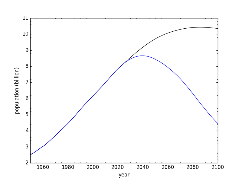
I already mentioned reproducing regional births nearly exactly, comparing my outputs to the U.N. model outputs (when I use all their assumptions). I can also look at long-term projections to see if I am tracking the U.N. model. Indeed, when I use all the U.N. assumptions, my model produces a peak population in 2084 at 10.38 billion, which is very similar to the U.N. result of 10.43 billion in 2086. The discrepancies I chalk up to granularity: I treat whole regions rather than summing country-by-country projections (and also do not separately model migration or evolution of the shape of age-specific fertility rates). But keep in mind that my primary curiosity is about whether peak population could conceivably be a mid-century vs. late-century phenomenon, so getting within two years and 0.05 billion is more than sufficient for my purposes.
Much can be learned from devising artificial scenarios whose outcomes are known. For instance, if we locked TFR at exact replacement (2.000) and completely turned off attrition prior to age 50 (so that every female born makes it through reproductive age), then we should eventually stabilize population once the inertia inherent in the population pyramid plays out (running the model until 2200 in these cases). This test taught me something cool, and obvious in hindsight. The initial test result using this forced model did not stabilize at zero growth as I expected, but at an annual −0.1% decline. The issue is that only 48.3% of babies are female. To achieve steady replacement, each woman needs to produce one female on average. This means producing 1.07 males for every female, requiring a fertility rate of 2.07 to hold the female population steady—which my model validates perfectly. Once re-activating pre-50 mortality rates held at 2023 levels (small attrition rates for these ages), the replacement rate sensibly went to 2.125, matching the rule-of-thumb that a TFR of 2.1 results in replacement.
In any case, the demographic model I built appeared to behave reasonably, and so it was time to explore.
Let’s Take it for a Spin!
Vroom, vroom! What can we do with this powerful new tool? Well, what I want to know is: what assumptions from the U.N. default model strike me as questionable enough to merit alteration, and how robust is the 2086 peak in light of loosening up the constraints?
While I could conceivably play with lots of knobs, I leave most alone (like regional age distribution of women at the time they give birth). The two I explore are:
- Time evolution of the Total Fertility Rate (TFR), regionally.
- Regional male/female survival as a function of age and time.
The first one is simple enough: conjuring a single number for each region for each year, in some continuous, seemingly sensible evolution. Here, I only employ two variants: the U.N. projection (which I questioned in last week’s post) and an alternative model I concoct (details below).
The second has many internal knobs one might consider, but the only one I modify is the function of time. For this, I confine myself to three simple options, just to explore a range of consequences:
- Keep the U.N. model that has monotonically rising survival rates (thus life expectancy).
- Lock in the 2023 survival rates indefinitely into the future (stagnant).
- Begin a year-for-year reversal around 2023 so that 2033 looks like 2013, 2043 like 2003, etc.
My willingness to vary survival odds is my way of saying that the U.N. model is an extrapolation of a long period of stability in an age of resource abundance and ecological integrity that is not guaranteed to persist. Life expectancy is already not monotonic in the U.S., for instance. In truth, the situation could reverse much faster than the gentle mirror symmetry I explore, as 75 years of stability prior to now is not necessarily the correct mode for the next 75 years. I’m not saying that I know the answers, but that one could plausibly explore scenarios that change even faster than what I allow above, and could not proclaim them to be definitively wrong or even outlandish.
My TFR Model
First, a reminder of the U.N. TFR model, and what seems “off” about it:
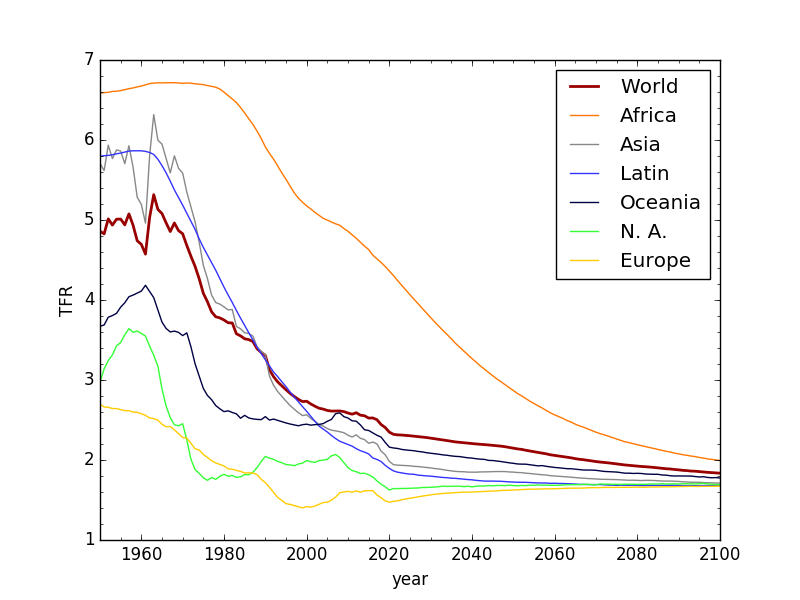
U.N. Total Fertility Rate data (pre-2020) and projections (post-2020). Like the Nazgul who suddenly drop whatever they are doing to race to the Ring, the UN model forsakes recent trends to race toward a steady asymptote—around 1.7—seemingly pulled out of thin air.
My beef with this is the abrupt and artificial interruption of trends when the model kicks in after 2020, arresting the dynamical fall of fertility rates—as witnessed—in preference for a theoretical long-term average that the entire world instantly begins converging toward (obeying who’s command, exactly?). [Note that the post from the following week emphasizes the UN’s terrible track record at “predicting” fertility decline.] Incidentally, I verified by exponential fits to the tails (beyond 2060) that an asymptotic TFR of 1.69 is the “attractor” that appears to constitute the “brains” behind the trend lines.
Instead, I do the following:
- Allow the pre-2020 slope to carry on without an artificial discontinuity.
- Curve into stability with an exponential time constant of 10 years.
I don’t artificially force a final value: just the time constant. The (actual) slope and (imagined) time constant alone determine the ultimate landing spot. The results don’t strike me as being unreasonable (i.e., well within the range of OECD countries around the world today):

My alternative future evolution of TFR (dashed) vs. the U.N. model (dotted).
Solid lines are data (past); dashed are my model projections; dotted are the UN projections (hard to see except for Africa, but that’s the most important to compare). I did something different for Africa. Noting the downward curvature of late, I respected the rapid evolution (let’s keep those efforts going!) and allowed continuation on that track until 2040. After 2040, I applied the exact same math for leveling out as I used for the others, also with a ten-year time constant. I did not fiddle with parameters: my first arbitrary-but-sensible choices of 2040 and 10 years produced a stable endpoint that seemed at least plausible, so I stuck with it.
Again, I’m not foolish enough to pretend that I can predict the future: just wish to explore what things might be possible with reasonable-seeming assumptions/inputs. Is my TFR model a fantasy? Yes. Is the U.N.’s? Yes. Is anyone’s? Yes. Are all equally realistic? No. Might there be a broad range of possibilities that can’t easily be ruled out? Sure.
The Survival Model
I can’t easily show survival models for all the age blocks and regions, so I pick a few illustrative examples for the world as a whole.

Survival rates from one age group to the next (in 5-year bins) for three different years (U.N. model).

Survival rate from one age block to the next, in 5-year bins, for four different block transitions.
In all plots, magenta represents female and blue represents male. The first plot shows a pushing-out of longevity. Indeed, the U.N. model has global life expectancy monotonically rising from 73 in 2023 to 82 in 2100. Reality, or fairy tale? Nobody actually knows! Right? It’s all a “what-if” game, using any number of defective crystal balls.
The second plot probably illustrates the U.N. model’s optimism most clearly. Each line represents the time-evolution of survival from one age group to the next (e.g., 15–19 to 20–24), shown for four different age group transitions. Youngsters fare quite well, naturally. Someone in the 65–69 age group today has a roughly 85% chance of surviving 5 years into the 70–74 group, getting progressively lower with increasing age. But the important piece is the time evolution: up and up, with no end in sight! As usual in the crystal-ball business, I can’t prove this is wrong any more than others could prove that it’s right. But I view the optimistic trajectory as the conservative product of an imagined world that is based on extrapolation of a temporary context (fossil fueled modernity in a resource-rich, essentially stable world not yet expressing dire ecological peril). On the downside of material inheritance-spending and in the wake of global accumulation of ills and ecological harm, I would not expect trends of the past century to happily carry on, oblivious to a changing world brimming with more people—and their increasingly destructive habits (including advanced medical care)—than it can tolerate.
The Results
Exploring two TFR models and three survival models produces six outcomes. For each, I report the year of the peak, peak population, and population at the year 2100. The last of these is really garbage. Once convincingly over the peak, so many things about our world could break loose that predictions become almost meaningless. But, I show the number to illustrate what would happen in a no-drama scenario where the demographic assumptions are simply allowed to play out, uninterrupted. The format is: year/peak/2100 (billions).
| U.N. TFR | Alternate TFR | |
|---|---|---|
| U.N. survival model | 2084/10.38/10.27 | 2053/ 9.11/ 7.50 |
| 2023 survival | 2065/ 9.56/ 8.86 | 2045/ 8.80/ 6.30 |
| Reversing survival | 2048/ 9.04/ 6.34 | 2040/ 8.66/ 4.44 |
So, there we have it. Most of the outcomes peak mid-century or before. Nothing matches the quadratic fit from last week’s post that hit zero in 2033, but the linear projection of recent trends reaching peak population in 2042 has company here. Indeed, one of the plots below shows a slope in growth rate evolution that is very consistent with the pre-2020 trend, similar to the simplistic linear fit case.
For maximum contrast to the U.N. model, below are the population curves and the growth rates for the earliest-peak case (in blue) compared to the U.N. model (black).
Population projections from the U.N. (black) and me (blue), corresponding to the alternate TFR model and reversing survival trends.

Projections of population growth rate from the U.N. (black) and my model (blue) in the case of the alternate TFR evolution and reversing survival.
The widening gulf between the two models is pretty stark, and all from modifying assumptions in ways that I would hesitate to call implausible. Note, in particular, that the growth rate evolution in the alternate model (blue) is more consistent with the pre-2020 slope than is the black line of the UN model. Which, indeed, seems like more of a disconnect? The U.N. model is better at reflecting the prior 60-year trend, while the alternate better captures the more recent reality. The question becomes one of whether the underlying drivers of the demographic landscape have changed much over the last 60 years.
In some sense, the alternate model I brewed up is not as severe as one might reasonably imagine. I basically said: allow TFR to continue its current trajectory (who are we to say it shouldn’t?), but let’s not allow things to get out of hand: force the plunge to settle on a decade timescale. But who says it actually will? Whatever mixture of dynamical influences are driving rates down now might well continue or even ratchet up! Likewise, the reversing-survival scheme is not at all a worst-case among plausible scenarios. Major disruption to industrial agriculture (from climate change alone; aquifer exhaustion; fossil fuel scarcity) and global food distribution could bring about famine that makes my gentle reversal toward late 20th Century standards seem rather cute and naive. There, there. Likewise, destructive resource wars and associated disruptions and casualties can’t be ruled out.
As I said before, I would not put too much stock in the modeled post-peak behavior, as lots of things will change in a post-growth world—not the least of which is our entire growth-based economic/market system. No one can confidently predict the mild-to-severe ripples and waves such changes might generate—even if market failure is exactly what’s needed to defuse the unsustainability bomb.
It is fascinating enough just to see that peak population might well happen before 2050. Even under the U.N.’s fantasy TFR evolution, alterations to the survival trends alone could credibly bring the peak to the first part of this century. I’m just saying: don’t buy anyone’s “95% confidence” about how things will go. It would seem to me to be far more open to surprises than one might have allowed.
To be clear, I am hoping that current trends—reliant in part on valiant deliberate efforts at taming the explosion—continue and bring about an early peak, thus acting as a giant relief valve on our ecological impact, perhaps staving off the worst fates for humanity and the entire community of life (like a sixth mass extinction).
We’ll Know Soon Enough
One consequence of having such divergent outcomes is that we won’t have to wait more than a decade to find out whether a near-term peak is in the cards. If fertility rates cease their downward trend and whip up toward an asymptote in the next decade… well then hats’ off to the U.N. demographers for knowing their business (but see the next post illustrating their embarrassing failures in this regard). If that’s what comes to pass, I will be disappointed that the ecological disaster is all the worse for it and modernity’s crash will be from a more dangerous height. I won’t care about being “wrong,” because I don’t see what I’m doing as prediction so much as pointing out that predictions are hard, and that a near-term peak is not implausible given recent trends and the potential for big changes on the horizon. The world simply may not go the way modelers assume based on extrapolation of trends from decades-past that transpired in the context of a growing material footprint powered by one-time inheritance spending. The context is changing fast: it seems that population growth has already somehow gotten some version of that memo, and is busy thumbing its nose at the U.N. projections.
Postscript: Questions for U.N. Demographers
I can appreciate the irritation that might be generated by amateur efforts at a complex subject. A common impulse would be blanket dismissal in classic baby/bathwater style: that’s the path of least resistance, anyway, and may even be warranted. But if willing to re-evaluate some things, here is a list of questions that might prompt a deeper dive.
- How dominant are trends over the last 75 years in informing your vision of the likely future? How much reliance is placed on extrapolation?
- Do you model various aspects of planetary limits like: failure modes of agriculture (thus global famine) due to climate change and the inevitable tapering of fossil fuels unwinding the Green Revolution; aquifer exhaustion; accumulating disruptive pollution; broken global supply chains; increased nationalism and hoarding as resources tighten; global resource wars; economic market/investment collapse under the looming prospect of “de-growth”; treating resources as one-time inheritances that are being spent down and will be even harder to acquire and process; the potential for ecological collapse as insect, bird, mammal, fish, and amphibian populations reach criticality so that co-dependent plants (and human animals) also fail? These questions are rhetorical, but the point is that a great deal of critical context is missing, in preference of “business as usual.” Modeling becomes easier (tractable) when stripping away most of the messy real-world influences—especially unprecedented, highly uncertain, deeply interconnected phenomena. The product should therefore inherit the profound underlying uncertainty: 95% confidence might really be 9.5%.
- What stops you from considering a “reversal of fortunes?” Uncertainty? Lack of precedent? Are the implications simply too scary to fully consider? Is it politically unpalatable or geared to avoid controversy? Is it a matter of hope? Is it guided by an unquestioned conviction that humans of the future will “figure it out” and put the volatile past behind us (utopian leanings)? Is the result valid/real or more reflective of a presumed outcome?
I recommend trying to honestly assess why it would be unacceptable to entertain vastly different assumptions. If you see your job as being realistic and not putting a thumb on the scale, then it seems important to objectively admit that many credible factors stand to prevent an extrapolative continuation of past trajectories in a world that is not what it was during the accelerating phase, and in fact, can’t continue as it has.
Next post in this series on near-term population peak.
Post-Postscript: Just out today is a fantastic op-ed by Nandita Bajaj (executive director of Population Balance) about the perils of pro-natalism in reaction to the prospects of population decline. The first paragraph is frightening!
Views: 17526
Excellent analysis Tom. After your very careful and thorough work, your results match the Limits to Growth BAU2 model (predicts peak around 2040 at around 9 billion people) with amazing accuracy (if accuracy is the right word here). It’s also interesting that economists and U.N. demographers did the same “baby/bathwater” thing for the original 1972 manuscript as they’re trying to do now. Few of these “experts” understand that analyzing trends is not the same as making predictions. But, apparently, they are able to make predictions without a careful analysis of these same trends. Seems ass-backwards to me.
Excellent! Thanks for putting the work in, very interesting and informative.
I'm curious what you would think about some other imaginary scenarios as well:
– what if African fertility rates now drop as fast as (say) China's did in the 1960s-1970s, or Iran's did in the 1980's-1990s..could we then see a population peak even well before the 2050s?
– what if, in spite of all the various aspects of planetary limits that you've been writing about, humanity nevertheless experiences a short-term (a century, or several centuries, etc.) large increase in our wealth and health…might such an increase push our fertility rates back above replacement levels, and so bring malthusian problems back along with it? In other words, if we actually managed to pull off the sort of economic-growth-utopia that many people think is likely to occur — but which you think is extremely unlikely — is it not also likely that fertility rates would be above replacement in such conditions? I'd be interested to hear what you think about this idea, precisely because you don't think it's likely to occur in the first place..
Really interesting analysis, Tom! I am particularly taken by the reversing-survival scenarios. You mention that "major disruption to industrial agriculture (from climate change alone; aquifer exhaustion; fossil fuel scarcity) and global food distribution could bring about famine." In your questions to the UN demographers, especially in question #2, you mention a number of factors, wondering to what degree the demographers have taken these into account. My question to you is: what about a global outbreak of a disease that makes covid look a sniffle? Is this something that should be somehow factored in to these types of projections? Wouldn't these other factors also make a population-reducing pandemic more likely? There are many reports that climate change, species loss, etc., increase the possibility of an Armageddon Virus. I know this is impossible to predict, but isn't this a distinct possibility?
I think it would be foolish to rule out crippling pandemics, or even run-of-the-mill diseases having greater impact in a strongly buffeted world. It's a good illustration of the difficulty such scenarios present to modelers. How does one handle a phenomenon that could dramatically reduce population but with, say, a 5% chance? Lacking a credible model for such unprecedented things, it is easier to leave them out entirely. For instance, they also do not include the non-zero possibility of nuclear war. In effect, projections answer the question: what might transpire if nothing major happens? Besides plagues and nuclear holocaust, peak oil/energy, resource wars, crop failure, climate crisis, economic collapse, and any number of other plausible things are basically shut out of polite projections.
Yes. But here's something to consider: there have been no full-scale nuclear wars, but there have been many pandemics. One is a health risk, the other geopolitical. The risk of pandemic is higher, and, it would seem, much more quantifiable and might be expressible in your model. We know something about modelling pandemics. Epidemiologists and public health experts can estimate the likelihood of a pandemic based on factors such as the rate of emergence of new infectious diseases, population density, global interconnectedness, and the effectiveness of public health measures, etc. The risk of nuclear war is far more speculative.
Tom, your comments between the computations are the important take-away.
Unless other important real world variables are included, single variable models are simply GIGO. Perhaps interesting for trend flavor, but far too isolated to mean much. It’s the difference between playing with a carbon molecule in a lab, and understanding its role in the living breathing dynamic biosphere.
IF JUST ONE of the many variables that contributed to the population spike (since 1800) were included in demographic analysis, it would expose UN models as exceedingly fragile – and misleading.
What is that variable? Fossil fuel. And many folks have “Done the Math” on fossil fuel modeling. Feedback looping just these two models together would better reflect realty – and cause frightening alarm (recall the outrage and opprobrium directed at Meadows et. al.)
A rapid fossil fuel production decline rate would dramatically alter current demographic charts.
Without electricity mortality rates soar (think shutdown of municipal water and sewer, loss of hospital and medical care, lack of commercial and residential heating and cooling…). Without transportation, supply-chains break, commerce crumbles, economies contract. Without Haber-Bosch, food production plummets, social and political instability turns violent.
Ahh, the surprises from “systems thinking”. Like the emotional impact of a sudden zen “satori”.
There is a fantasy held by many that a falling TFR and a falling pop growth rate means we’re gonna avoid collapse. Which is of course silly. It makes little difference if population reaches 10B before or after mid-century. Because it’s still grossly above carrying capacity. Rees’s ecological footprint analysis is not perfect, but it should be clear by now that an 8B biosphere meat grinder is more than enough to ensure collapse of global ind civ.
A certain famous ship in 1912 added water to its hull at a rapid rate. That rate then slowed down dramatically (hooray, we’re saved!!) And then that rate became zero. Good news, right? Not when you consider that by then it was at the bottom of the North Atlantic.
Point being that “rate” is an isolated variable and a human construct and does not represent situational reality.
Nature has only one response to overshoot – and it doesn't preclude extinction. See the St. Matthew Island caribou example or John Calhoun's research. Again, not perfect models, but useful. And imho ignored at our peril.
Indeed, fossil fuels are the primary reason we have 8 billion people, and their inevitable removal from the table will almost certainly translate to a major reduction of fed (alive) people. See an earlier post where I looked at this explicitly: https://dothemath.ucsd.edu/2022/12/finite-feeding-frenzy/
And yes, the real world can't be anything other than a complex interwoven system, while models will always be pale and fragile caricatures missing the larger context. They might work okay for a while, until the context shifts and they become meaningless.
I just added a post-postscript pointing to a related piece just out today from Nandita Bajaj of Population Balance: https://www.counterpunch.org/2024/06/04/making-more-babies-to-drive-economic-growth/
Governments all over the world are trying to increase fecundity, all in the promise of "growth":
https://www.counterpunch.org/2024/06/04/making-more-babies-to-drive-economic-growth/
Our comments "crossed in the mail"—glad you came across Nandita's op-ed yourself and announced it here…
Thanks for another great analysis, Tom! I was immediately struck by the disparity in TFR's between Africa and all other regions. It seems that this is going to exacerbate immigration pressures in a big way. Already, immigration into Europe and into the US is causing a rise in far-right populism – in fact it may be the primary cause. A very worrisome trend.
I'm going to steal your questions for the UN and send them to the County Council where I live the next time they come out with a plan that assume unending growth. Excellent questions, thank you.