You may be familiar with the term “hockey stick curve,” used describe a trend that has been flat/stable for a very long time, but shoots up at the end of the series in dramatic fashion, resembling the shape of a hockey stick. Hockey can be a violent sport, and it’s easy to get hurt by even one well-aimed swing. Today’s world is being battered from all sides by countless hockey sticks. Mostly, they seem to be targeting Earth’s critters, who are getting bludgeoned unsparingly. But in the end, we’re only harming ourselves.
This post is structured as a gauntlet of hockey stick curves that may leave the reader feeling a bit bruised. Depending on what’s being plotted, many of the graphs shoot up like an exponential, but a few are careening downwards. A theme emerges: the “bads” go up, and the “goods” go down—and not by coincidence.
People and Money
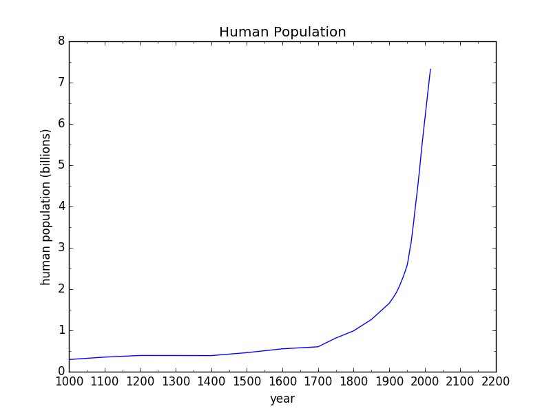
We’ll start simply. Human population looks like a hockey stick curve. This is not a surprise to anyone. The fact is greeted with a range of reactions from joy to despair, but mostly simple acceptance. Whatever your disposition, here’s what it looks like.
All the plots in this post will share the same time axis, from the year 1000 to 2200—even for those lacking information across the whole span. The point will be to emphasize the anomalous nature of recent history: what I call the fireworks show. Maybe it would be more fair to use a 10,000 year span (civilization), or 200,000 for modern homo sapiens, or even 3 million years for the entire human saga. On such scales, the present era loses its graceful curve and looks rather more like a sudden brick wall.
Anyway, fine. Population has surged, but what of it? Am I attaching a moral judgment to this? In itself, no. But this is just the first stick—consider it a warm-up.
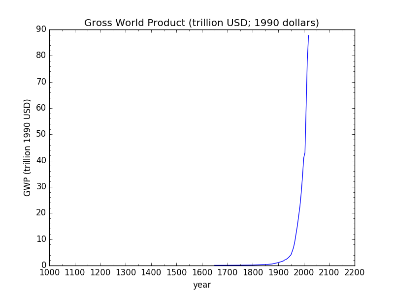
Next, we look at Gross World Product (GWP) in constant dollars.
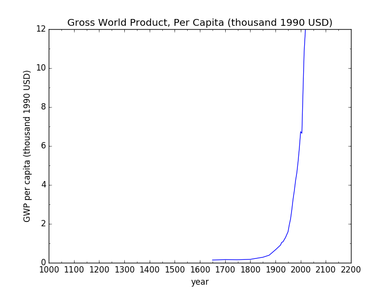
It is, of course, another classic hockey stick, essentially acting as a proxy for human activity on the planet (the use of energy and materials tends to follow GWP pretty closely). You might shrug this off as just a direct reflection of population, but not so fast. Most importantly, so what if it were? Even in that case, it’s still a measure of absolute impact, which is critically important, where the ecosystem is concerned. In actual fact, GWP per capita has also risen like a hockey stick.
This, to me, is truly alarming from an ecological point of view: not only has the human population grown like gangbusters, but the level of affluence per person has soared by an even larger factor. The impact on our planet scales as the product of these two (essentially, the GWP curve from before).
Energy and Materials
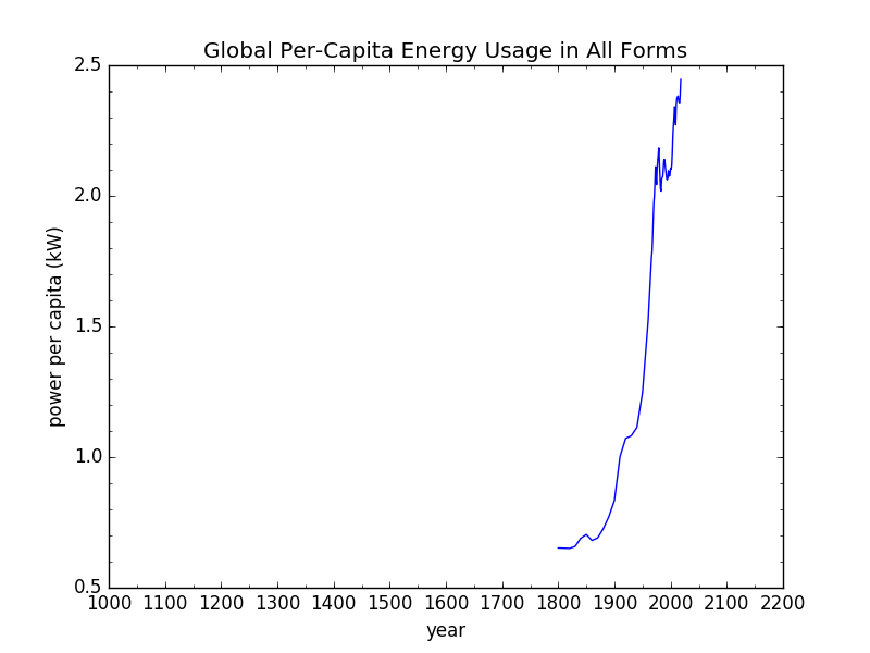
A similar story is visible in energy resources. Although the data for this plot starts in 1800, biomass provided a low-level baseline (roughly scaling with population) prior to this time. Yup: another hockey stick.
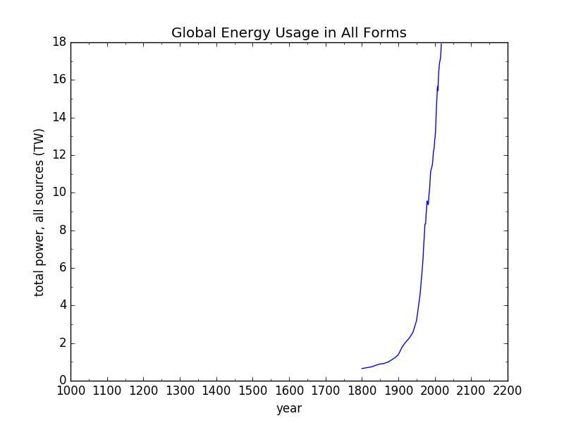
Rate of global energy use in all forms (fossil fuels, renewables, nuclear); data from Our World in Data (OWID).
The upward swing in the energy plot is almost entirely a story of fossil fuels, whose ridiculous amplification of energy available to humans is largely responsible for the population surge, the economic explosion, and a number of ills to follow.
As was the case for the GWP plot, it is instructive to see that energy per capita has also shot up over the last two centuries, as another measure of increasing affluence.
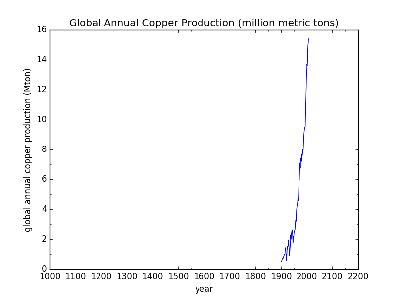
One significant application of all this energy is in extractive industries. A plot of copper production—as a representative material—since 1900 confirms that we are pulling non-renewable materials out of the planet at an accelerating rate for yet another hockey stick curve.
Because I don’t continue plotting per capita versions, you can confirm for yourself increases in per-capita consumption by noting that from 1800 to now, population has risen by a factor of (only) 8, while from 1900 to now it’s a factor of 5. So seeing copper rise by a factor of 16 or more since 1900 immediately translates to a per-capita increase.
I don’t see much point in tracking down data for other mined materials like aluminum or lithium, or products like cement. (I could be accused of the unsavory crime of beating a dead horse—with hockey sticks) We would not expect anything but hockey stick curves to emerge from such an exercise—at least in broad-brush.
Pollution and Waste
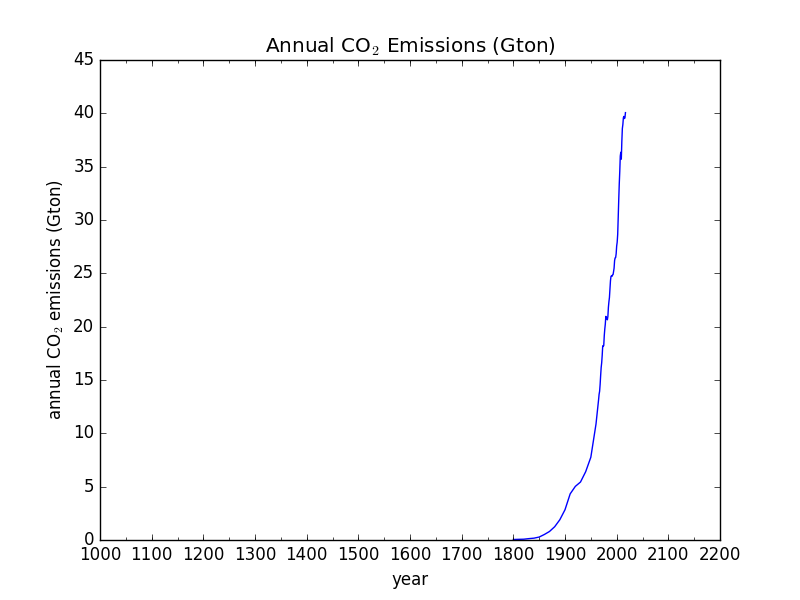
So that’s a snapshot of resource use. What about pollution and waste? A very obvious form of pollution is CO2, which is probably why most people have heard the term “hockey stick curve” to begin with. Here is the annual (not cumulative) emission of carbon dioxide due to burning fossil fuels.
Emissions were negligible until 1850 or so, but have shot up since. In complete disregard for Kyoto and Paris agreements, each year emits more than the prior one—for the simple fact that fossil fuels power economies like nothing else can.
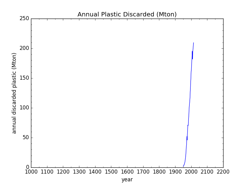
For waste, I immediately thought of plastic as a proxy for what’s going to landfills, and the data turned out to be pretty easy to find. I had to combine total plastic production with the fraction discarded as waste (now down to 55%) to produce the plot, but here it is.
Plastic was a little late to the landfill scene, but despite a monotonically growing recycled (and incinerated) fraction, the total amount of waste continues to climb like a mountain goat trying to escape its fleas.
Ecological Impacts
So what has all this bustle of activity done to the non-human biosphere? Are the squirrels happy with our progress? The first hint comes in the form of extinction rates. The background rate is expected to be about 0.1 extinctions per year per million species. For context, we estimate something like 10 million species that are alive today, so the background rate translates to a normal level of one extinction per year across the globe.
The data I found has pre-1900 and post-1900 numbers for birds, for mammals, and for amphibians. In order to make a plot, I picked 1960 (halfway between 1900 and now) as the post-1900 date and 1840 (symmetrically 60 years before the transition) as the pre-1900 point, to come up with the following graph.
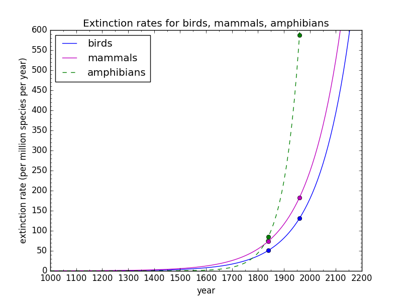
Extinction rates for three classes of vertebrates; data from OWID. Though not shown, the implicit data point at far left is the background extinction rate.
Amphibians are in the greatest peril, followed by mammals and birds. I also hear that insects (including, of course, many pollinators) are not doing so well, and encounter “evidence” in the form of fewer bugs smashed by our windshields these days.
Note that the extinction rates were already substantially above the background rate well before climate change entered the scene. I forced the exponential curves to go through the available data points as a guide to the eye, so they should not be taken literally as predictions or even as an accurate history. What is certain is that the extinction rates are thousands of times higher than the background rate, and rapidly getting worse. If the hockey stick fits…
Extinction is a worst-case ecological impact: a final and irreversible winnowing of life on Earth. But on the road to extinction is population reduction. In 1970, the Living Planet Index (LPI) began tracking over 20,000 populations of nearly 5,000 species of vertebrates, finding that the number of animals now is only 32% what it was 50 years ago. Translation: most of the animals (in this sample) have disappeared in my lifetime. To be sure, the LPI can’t be a perfect capture of the situation, but it’s about 20,000 times better than anecdotal observations, and the outcome is a sad one.
Mammal mass on this planet is now 96% made of humans and our livestock, leaving a paltry 2% of mammal mass in the form of wild land mammals and 2% in marine mammals. If this doesn’t signify a boot on the throat of Earth’s creatures, I don’t know what would. The unjust tragedy is enormous in scale, but earns a tiny slice of our attention. If we could hear the animals talk, we might expect to hear: “I can’t breathe.” Would we take to the streets on their behalf?
In any case, we can plot the wild mammal mass on land as a function of time to see the following depressing inverted hockey stick:
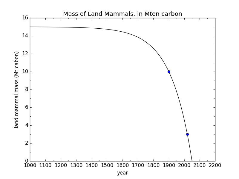
Carbon biomass of wild mammals on land; data from OWID. The first data point as far off the left edge.
If the exponential fit has any truth to it, we’re cruising toward effective elimination of wild mammal mass on land by 2050. OMG! Does this result justify ringing an alarm bell, or is it all part of our elegant plan for world domination?
Closely related to animal population decline is the disappearance of habitat, commonly in the form of deforestation. Data on the fraction of Earth’s land covered by forest produces the following plot.

Global forest cover as a fraction of land area; data from OWID. The first data point as far off the left edge
If continuing the current trend, we might expect to be deforested by 2200. I could make a case for a more rapid demise, whereby declining fossil fuel supply may incentivize burning more firewood, as is already happening in Europe in reaction to reduced methane availability. Prior to fossil fuels coming onto the scene, large areas of Europe were being denuded, so that timber for ships had to come from across the oceans. Thus, trees have had a bit of a reprieve this last century (while nonetheless still declining) thanks to fossil fuels. I compute that satisfying our current 18 TW energy appetite via biomass corresponds to burning all biomass on earth (land and sea, plant and animal) over the course of just 15 years. If we turn to forests to replace even a fraction of our fossil fuel habit, these trends of decline become even more dire for forests and for the animals that depend on them.
At this point, a number of people may wish to point out that some areas in the U.S. are experiencing reforestation. This is expected when a country outsources manufacturing and extractive industries over the horizon. The global story is the important one, preventing such local shell games from clouding the overall picture. In this case, American demand for resources causes three trees to disappear elsewhere for every one that grows back on American soil—or something to that effect. There’s no hiding.
Presumably, in the distant past, all of the forest cover tracked in the previous plot was primeval, or “old growth.” Today, only 24% of the forest cover is old-growth. If this fraction was 50% in 1900 (my guess), we would get the following plot for old-growth forest cover:
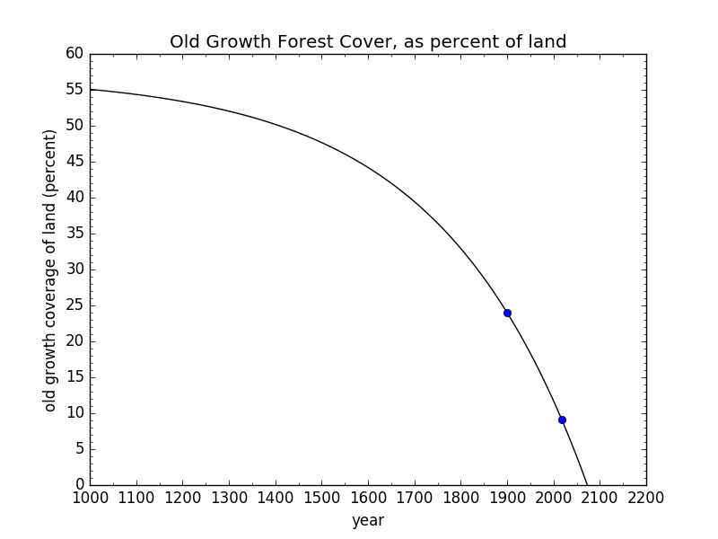
Old-growth forest cover as a fraction of global land area; data synthesized from OWID. The first data point as far off the left edge
It doesn’t look good: gone by the end of this century. How many animals and species do we consign to elimination as a result? Is the palm oil worth it?
More Where That Came From
This is not an exhaustive set of such curves. I spent less than one day scooping up data, plotting it and drafting the post. You can easily imagine other metrics that would have the same form: they’re everywhere we look. Hint: almost anything dealing with modern human activity is likely to realize the hockey stick shape. But I think I’ve landed enough blows to leave a lasting mark.
Sorting Good and Bad
Whatever model we have adopted for existing on this planet, it seems to be a poor choice. It appears to be on track to fail. The dream of eventually having 10 billion people living at American standards completely ignores the glaring fact that we seem to be circling the drain even at today’s impact level (i.e., overshoot). How could we possibly entertain the factor-of-five increase in resource demand that would accompany a realization of “the dream?” It seems delusional to me—and likely to turn into a nightmare if pursued.
As bad as climate change is, it’s not the core problem—just another symptom of a flawed approach to life on this planet. Many of these hockey stick curves were well underway before climate change began to disrupt the environment in recent decades, only to compound already-serious crises. Replacing fossil fuels with renewable technologies and storage will not automatically lower resource demands on the planet, and may well only ramp up the pressure [added later: see the graph in a subsequent post for evidence of this greater resource burden]. Just the massive build-out and maintenance of this infrastructure is an enormous draw-down on non-renewable resources and concomitant ecological distress. Ironically, if we somehow achieved “unlimited” energy, I tremble to think what we would use all this energy to do. Without a reversal of mindset, it seems we would simply ratchet up our crushing assault on the non-human world for the sake of short term profit and (ostensible) human benefit.
Here’s a proposed rubric for deciding what things in life are “good” and what things are “bad.” If its plotted curve is a hockey stick pointing up in the present system, it’s probably a bad thing. Extinctions are going up: extinctions are bad. CO2 is going up: CO2 emissions are bad. Waste/disposal is going up: waste is bad. Meanwhile, wild mammal mass is going down, so wild mammal mass is good. Forest cover is going down, thus forest cover is good.
Now for the trickier elements. GWP is going up. So…is GWP bad? I would say yes: a financial gain is an ecosystem loss, almost every time. Think about restoring ecosystems or setting them off limits to exploitation/extraction. Where’s the money in that? Money points the other (wrong) way: toward ecosystem failure, not ecosystem (thus long-term human) success.
Human population is going up. Also bad? Well, look. We’re not exactly doing the planet (or ultimately ourselves) any favors presently. Will adding more humans that subscribe to our current cultural model somehow make the situation better? Will improving standards of living (thus increasing resource demand) mysteriously turn things around? It’s hard to see how—not without enacting a whole new model.
One point to make is that it’s not a problem with humans per se. It’s the system humans have adopted: the one we call our global civilization. But that choice is not written in our genes. We are not obligated to cling to our current (and recent) approach to living on this planet. That’s where any real hope lies. But the change would have to be radical, and performed quickly in order to avert collapse. Thinking it can happen may be its own form of delusion.
As thrilling as this ride is (think of a roller coaster), be aware that we didn’t design the whole course for a safe and sustainable run. We therefore cannot have laid all the tracks, yet. Initiating our ride was thus a little premature, and we may regret the outcome. Can we step off the train early, before it finishes its first climb and commits to whatever plunging disaster awaits, then maybe make our way back down to safety along the side of the track?
Not content with one stupid analogy, here’s another. This fireworks show we’re witnessing is spectacular and awe inspiring. The hockey stick curves are a representation of the unprecedented dazzling nature of this experience. But now we recognize that we’re strapped to the next launch, and the fuse is lit. How enjoyable is a fireworks show to a firework?
What will it take to dowse the fuse, or shut off the roller coaster? How big of a hint do we need that this isn’t likely to work. At the very least, let’s pause and reconsider. If, after a thorough investigation, we decide to pick up where we left off, well, what real harm is done—and kudos for taking it seriously. More likely, we will continue to hear the ooohs and ahhhs, and watch people waving their hands in the air like they just don’t care.
[See also a companion follow-on post: A Climate Love Story.]
Postscript
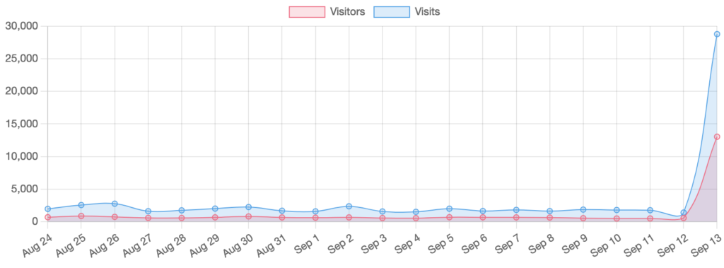
On the day I posted this piece on Do the Math, someone threw it onto Hacker News, where it got a fair bit of attention. As a result, the site statistics looked like the following:
I trust I need not explain how funny I think this is. I also have a fairly robust idea for how this curve will look a week from now. Just sayin’.
Post-Postscript
A week has gone by, and what did the graph end up doing? No surprise here (see below). Many of the hockey sticks in this post could end up like this—and those that deal with non-renewable resources must, ultimately.
Views: 78318


