The numbers had already left impressionable marks on me, and as they swirled in my head for some months I certainly had a sense for the urgent warning they wanted me to hear. But it wasn’t until I rubbed the numbers together that the message really rang out. Then plotting the historical evolution shook me anew. I was staring at the ecological cliff we appear to be driving over.
Let’s build the punchline from a few facts that were already rattling around in my head. Human population, at 8 billion today, was 1 billion around the year 1800. At a global average human mass of 50 kg, that’s 400 Mt (megatons) of humans—matching the 390 Mt I had seen in a superb graphic from Greenspoon et al., shown later in this post. This same graphic shows wild land mammal mass at 20 Mt today. I also knew that wild land mammal mass was about 4 times higher in 1800, and 5 times higher 10,000 years ago.
Put these together, and what do you get? In 1800, every human on the planet had a corresponding 80 kg of mammal mass in the wild. Wild land mammals outweighed humans in an 80:50 ratio.
Today, each human on the planet can only point to 2.5 kg of wild mammal mass as their “own.”
Let that sink in. You only have 2.5 kg (less than 6 pounds) of wild mammal out there somewhere. A single pet cat or dog generally weighs more. Not that long ago, it was more than you could carry. Now, it seems like hardly anything! I especially fear the implications for mammals should global food distribution be severely crippled.
The graph is even more alarming to me.
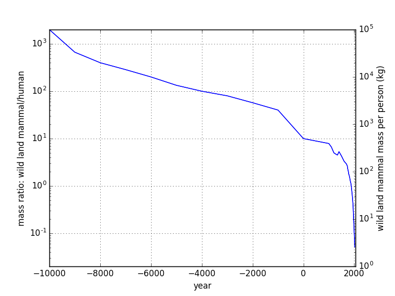
Mass ratio (left axis) and total mass (right axis) of wild land mammal mass per person on the planet. Note the logarithmic vertical axis, as is necessary to show the wide range of values.
The vertical scale is logarithmic in order to show the enormous range involved. The precipitous drop in the present age is staggering. How can we look at this and think that we’re heading in the right direction? That’s modernity for you, folks.
Views: 10087